Content
Clear the stage for a powerful brand experience! It is only the interplay between high-quality content that creates a positive brand experience at every digital touchpoint.
The right choice of images
Good images are important on all media channels. But the digital space makes some very special demands on the motif. Observing the following tips will help guarantee a consistently high quality of the overall appearance:
Teaser images
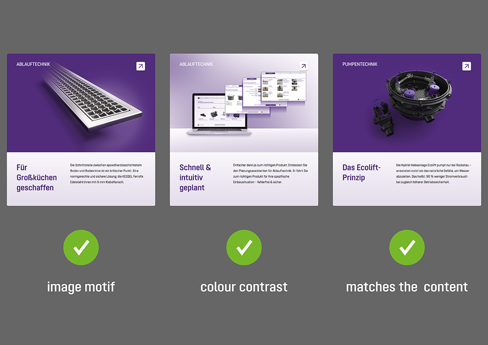
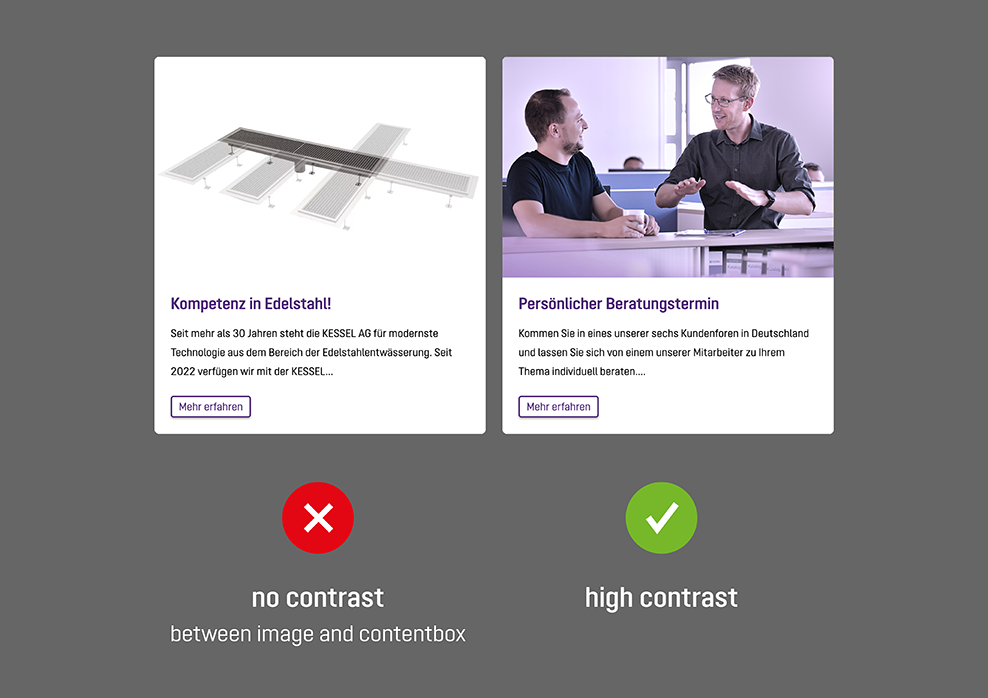
Convincing, high quality, functional: teaser images have to meet certain criteria so that they serve their purpose in the best possible way. This means, amongst other things, that the image motif has to match the content, is aesthetically pleasing, and that the colour contrast has to be strong enough.
Cropping
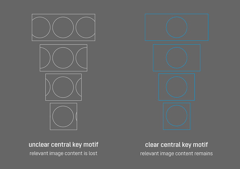
If an image is used as a teaser image, it is at the same time the cover motif. Images with a clear, central key motif are a better choice here: less of the relevant image content is then lost during cropping of the image or illustration to different formats.
Key motif
Distinct, striking and self-explanatory: we use images with a clear key motif and whose content matches the text. This helps users find their way around. Motifs with a lot of details are less suitable – which is why we prefer to use images whose visual content is limited to the essentials.
Teaser motifs are always positioned on a coloured background. In this way, they stand out clearly from the background. Watch out: avoid a white background tint.
Visual language
The same basic rules as for print applications apply for images in digital applications. Visuals from the KESSEL photo pool are usually used in this case.
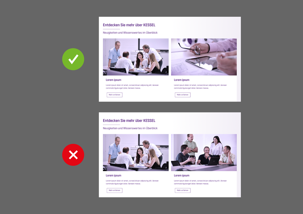
Image rhythm
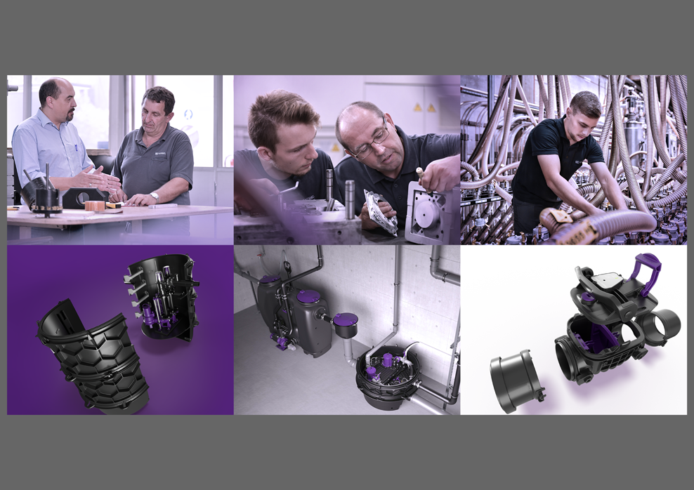
If several images appear together in a viewport, make sure that the images have a different composition and perspective. Different compositions make the layout more varied and exciting.
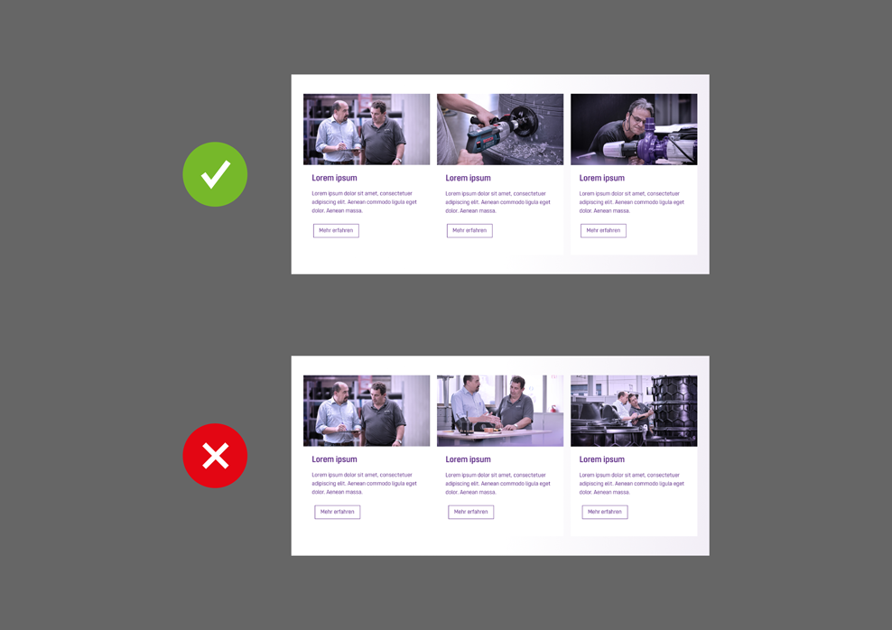
Protagonists
If you have to position several images whose content are not related alongside each other, try to choose images showing different protagonists if possible.
Text and language
We use a consistent narrative voice in our written publications – this naturally also applies to digital applications. Further details of the KESSEL tonality and our binding rules on terminology and spelling can be found in the relevant guidelines.
Moving image
A number of topics can be made more entertaining and exciting with videos and animation. As a result, the information communicated is more likely to stick in people’s minds. The accompanying guide explains how we bring moving image content into a consistent form.
One brand – one experience
Images, texts and moving images go hand-in-hand in our digital applications. It’s all about attention to detail in terms of high quality, aesthetics and functionality. But we always keep the big picture in mind as well. This is the only way to create a comprehensive user experience that strengthens our brand in the long term.