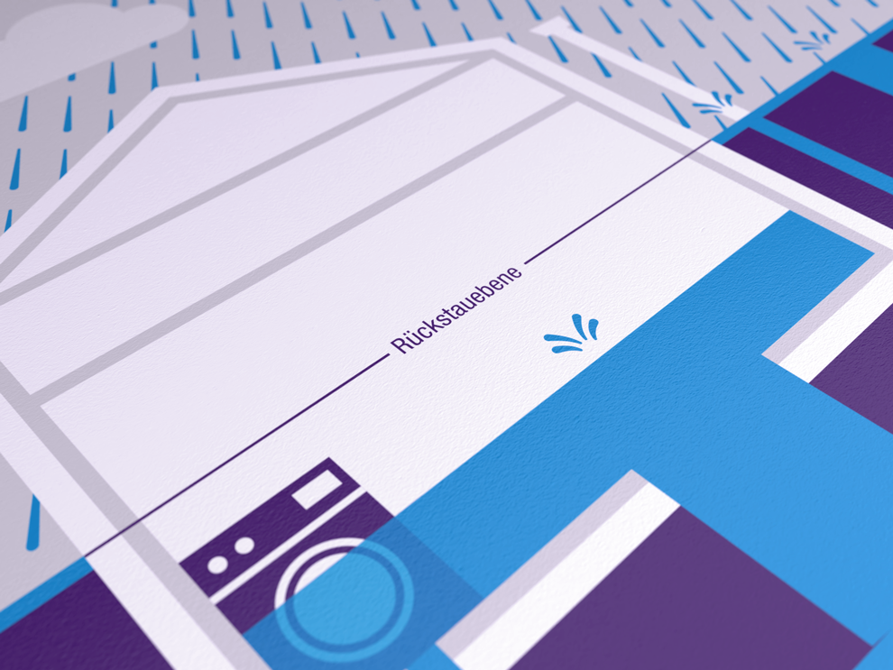
Our centrepiece: the “K”
The KESSEL logo is our central branding element. Besides our brand, it also represents our tradition: the stylised spray nozzle with the letter “K” enclosed therein stands for the production technology that we have been developing for over 60 years.
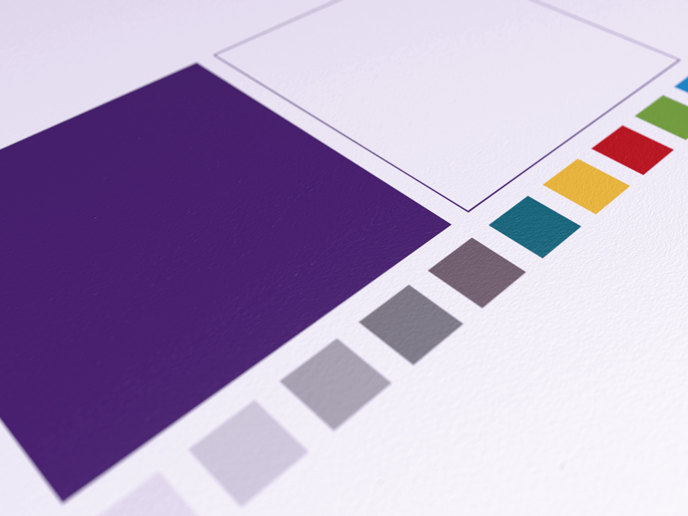
Coloured logo
The KESSEL logo is always used in a fixed combination of a word mark and design mark. It is either used in violet on white or white on violet depending on the application.


Colourless logo
The logo is used in black or white if the coloured logo cannot be used (e.g. for stamps). The colourless logo is also used for special applications, such as blind embossing, window signage or engraving.


Rules of application
Positioning
Dont’s
Sub-brand logos only in exceptional cases
Generally speaking, only the KESSEL logo may be used as a branding element. However, sub-brand logos (such as the one shown) can be permissible for especially important and independent topics – not departments. This will be decided by the Management Board and Marketing. Sub-brand logos are always used together with, but separately from the main logo.

Download
The logos are available in three file formats to make them easier to use:
EPS: Vector format, can be enlarged / can only be opened and viewed in professional graphics programs
JPG: Bitmap format / CANNOT be enlarged / NOT suitable for professional printing
PNG: Bitmap format with a transparent background / CANNOT be enlarged