Concept & design
Intuitive operation, high user orientation, device-optimised performance: our digital brand experience is designed to be convincing on various channels.
Concept
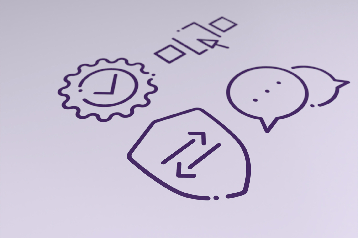
Certain basic considerations already have to be taken into account when designing a digital application. These may be technical parameters or application-friendly structures.
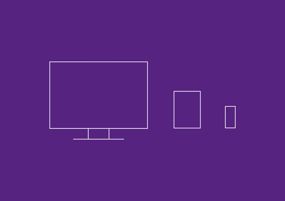
In principle, every new digital service product is designed to be responsive. This means that it is independent of any device. The digital application can thus be used with various devices – from a PC to a smart phone.
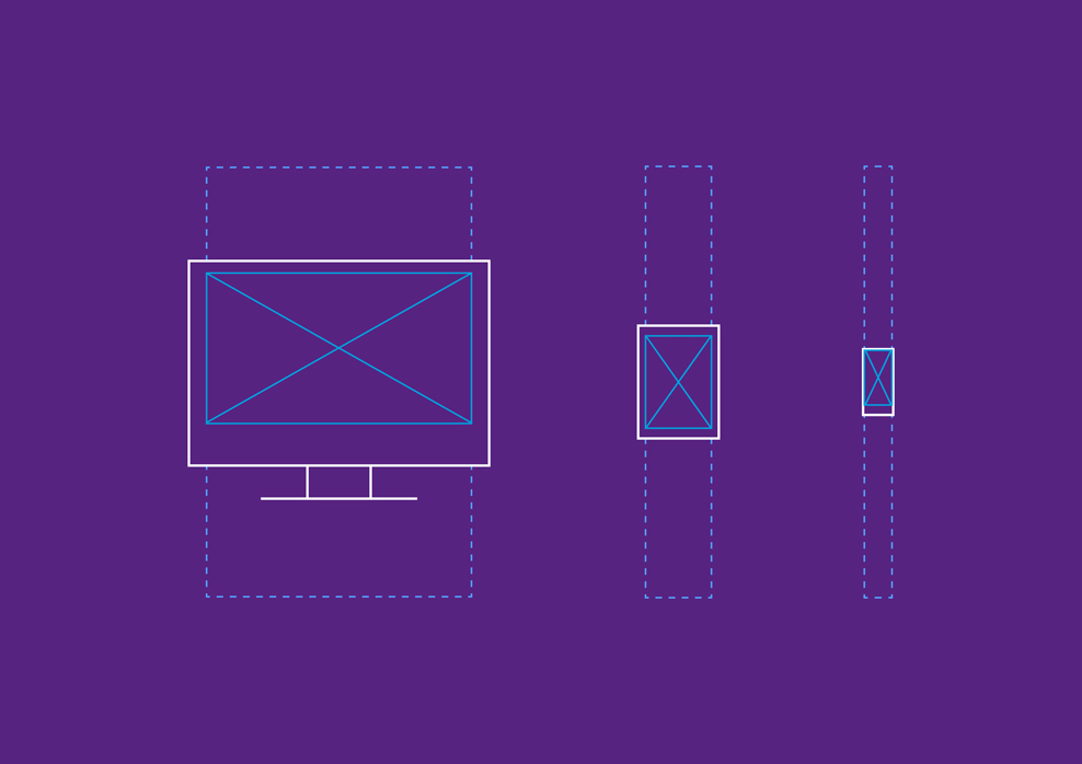
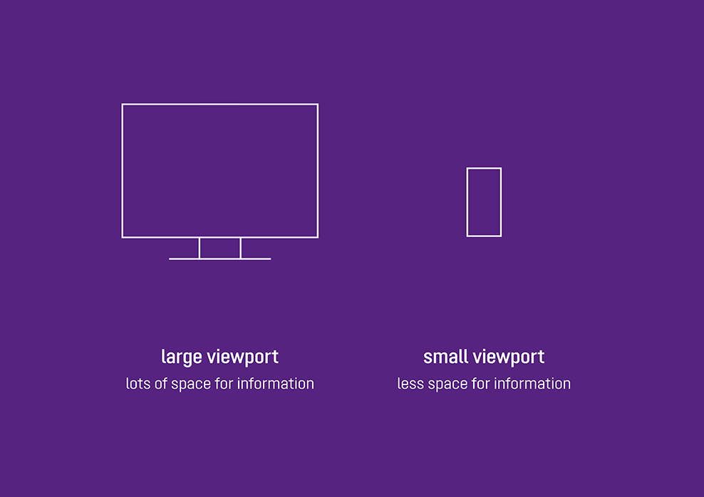
The viewport is the maximum visible area of a digital application depending on the device used. Depending on the actual device, his leads to different aspect ratios and resolutions.
Example:
Viewport on a desktop vs. tablet vs. mobile
The users and their respective behaviour have to be taken into account for every product. In concrete terms this can mean:
Example 1: a planner usually works in an office, often on a desktop computer with a large or even second monitor.
Example 2: a fitter works on site, and normally has only a smart phone or at most a tablet.
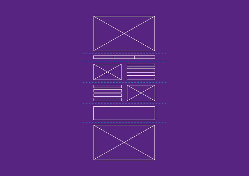
We want to get our users to where they want to be, in other words the information they need, as quickly as possible. We do so by way of a well thought out structure:
- Sensible breakdown of the contents in sections
- Bear in mind user navigation paths (subnavigation, anchor links etc.)
- Cross-references to relevant content
We ultimately achieve a high user friendliness with a design that is tailored to the needs of the target group. At the end of the day, this leaves a lasting, positive impression.
Digital applications are based on the brand basics in the brand portal, along with the fundamental layout rules for print media:
Design
All of our digital applications follow standard principles in terms of structure and design. The following tips will help you achieve a uniform KESSEL look:
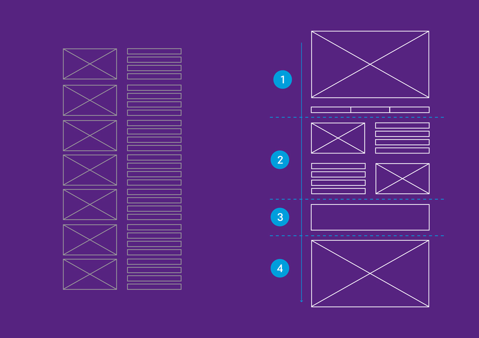
A logically organized layout ensures clarity. This allows users to access the most important information quickly.
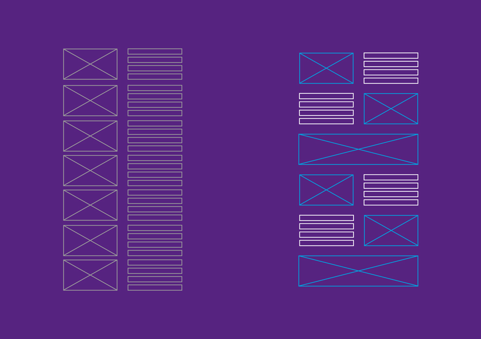
A monotonous rhythm quickly becomes boring. An exciting interaction between text and images, on the other hand, makes for variety and keeps people interested.
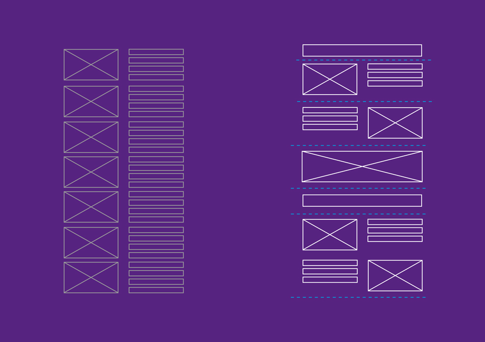
We use white space as an effective design element. Empty spaces in a layout help maintain the tension and attach a certain weight to the content.
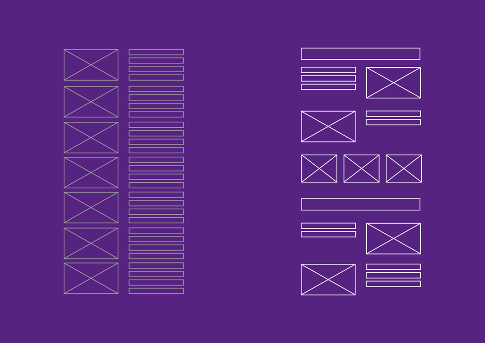
Images that alternate on the left and right, multi-column rasters or bled off areas: we make the layout animated and dynamic through a varied, asymmetric design.
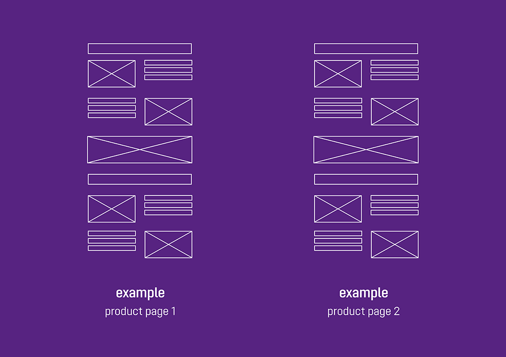
Consistency gives people a sense of orientation. This is why pages in a specific content category (e. g. product details pages, job descriptions, references etc.) have a uniform page layout.