UI elements
Buttons, input fields, checkboxes & co.: UI elements play a crucial role in how users interact with, experience and deal with a digital application.
Components
There are fixed parameters that precisely define the appearance, shaped, proportions and behaviour of certain basic digital components. Frequently used UI elements such as buttons are ready to be downloaded. We base the design of new components on existing elements. The most frequently needed components have been compiled here:

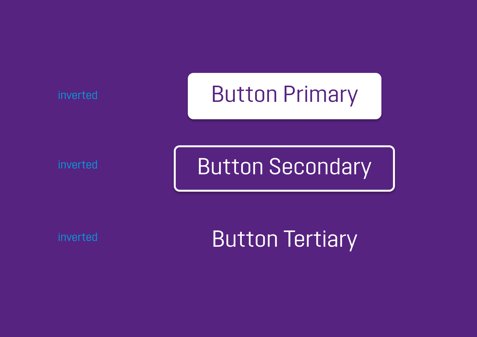


Buttons have a three-level hierarchy: the more important an action prompt is, the greater the visual emphasis on it will be. The levels are divided up as follows:
Primary
This hierarchy level is reserved for the most important action (e. g. CTA). Only one primary button is used for each viewport. It is only used for positive actions s uch as “Confirm”.
Secondary
A number of secondary buttons that are not as important as a CTA may be used for each viewport. This hierarchy level can be used for alternative actions (e. g.“cancel“).
Tertiary
This hierarchy level is used for all further actions, e. g. downloads.

The font sizes have been defined for all digital applications to ensure a uniform user experience.

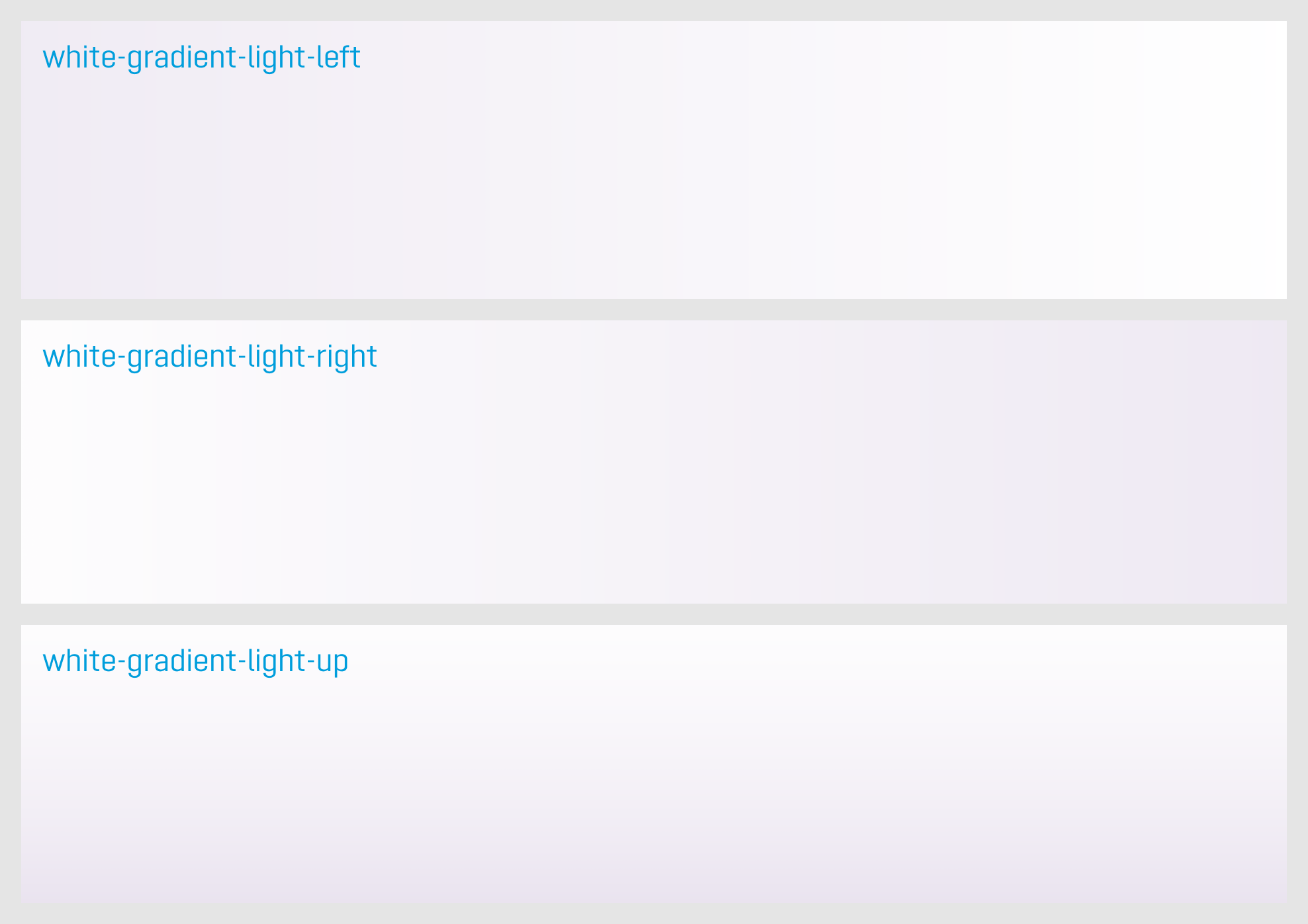

A variety of different background tints are available to create an exciting design and to better structure the content. You can choose between the following backgrounds:
- violet gradient up
- violett gradient sideways
- white gradient light left
- white gradient light right
- white gradient light up
- violet
- white
You can download a master file containing an extensive collection of existing icons. This file is being constantly updated and the latest version is always available:

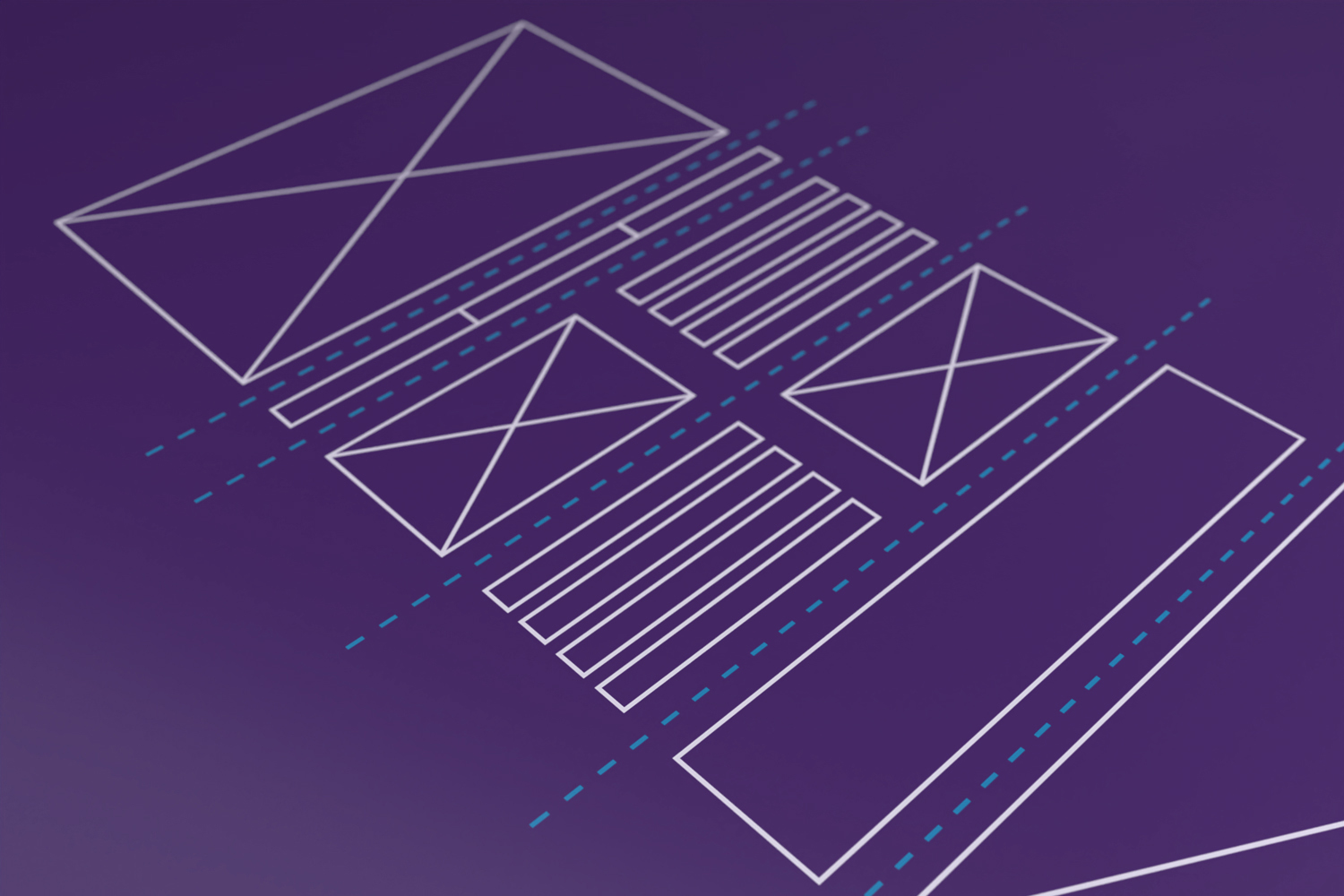
A number of illustrations have already been designed, all of which have been compiled in a master file. This file is being constantly updated and the latest version is always available:
Additional button variants
You can not only adapt the text in buttons: a number of other variants with icons for links, arrows or downloads also can be used. Since these are not available by default in the KESSEL CMS, their use has to be taken into account during the design phase. Do you need a separate button variant for a certain digital application? The button library can be expanded if necessary.

Animated transitions
Showing and hiding images, moving modules or opening a menu: the design of transitions in our digital applications is always fluent and natural. This impression is achieved by means of so-called easing in CSS animations. We use the following standard parameters for the unique KESSEL brand experience:
TYPO3 module set
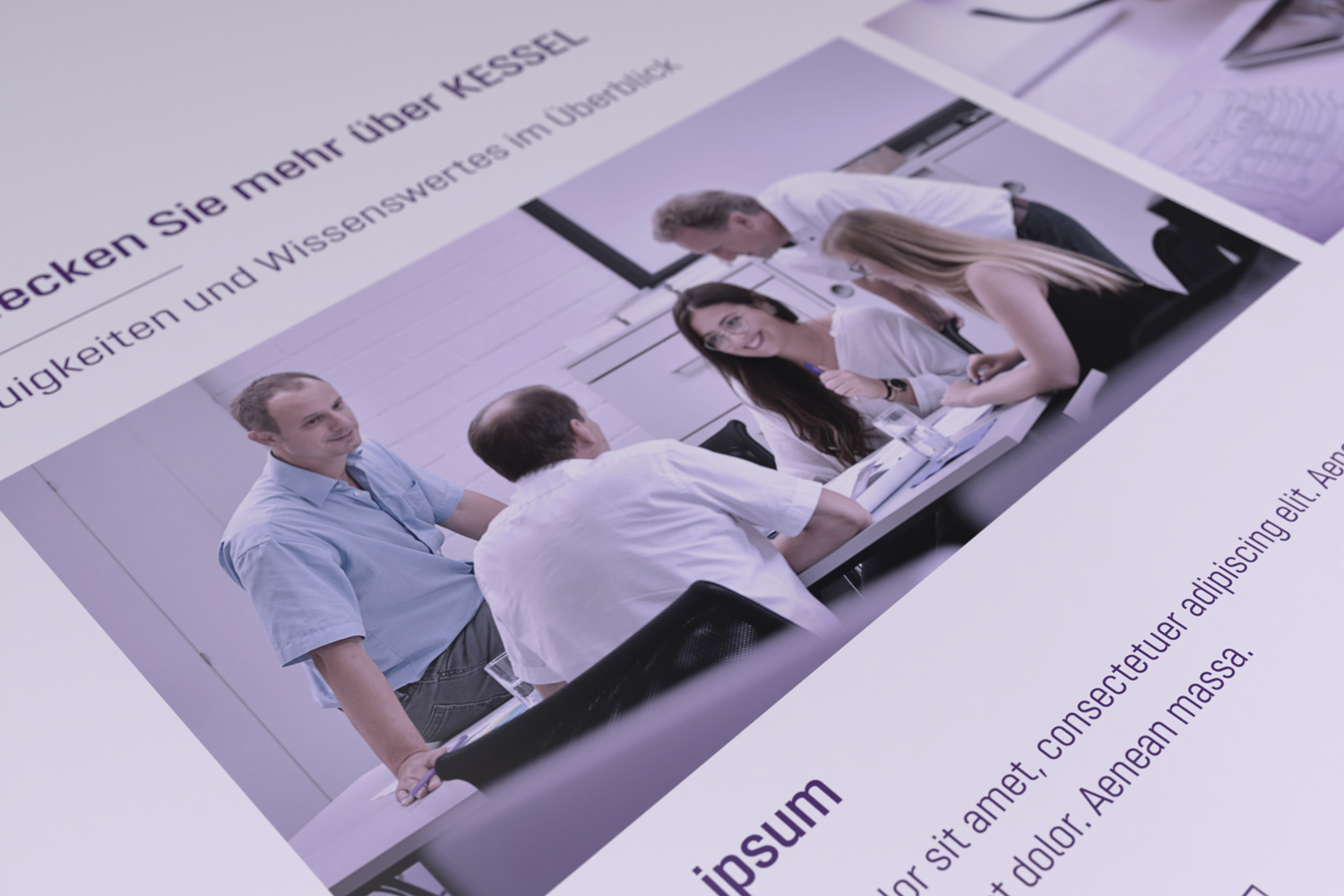
TYPO3 CMS provides a large number of modules that allow you to create your own website and fill it with your own texts and images. Some of the firmly defined modules can be customised, e.g. by choosing a certain background colour or by showing/hiding a button. Best of all: this set of modules is being permanently expanded. Newly developed modules thus offer an even wider range of functions.