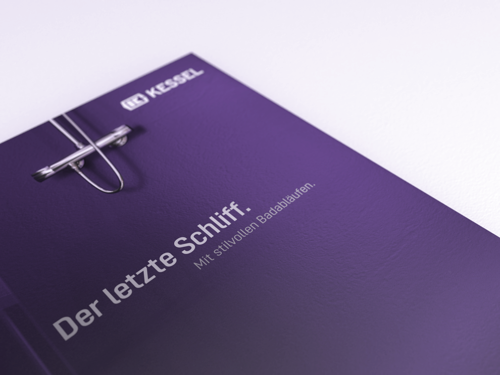
Subtle emphasis
Design elements are used sparingly and purposefully in our print media to create emphasis and structure content. They complement the modern appearance with their simple, functional shape and colour.
Design element
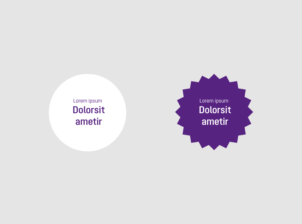
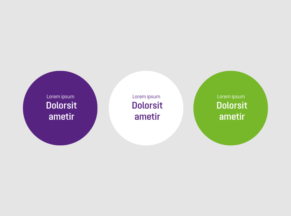
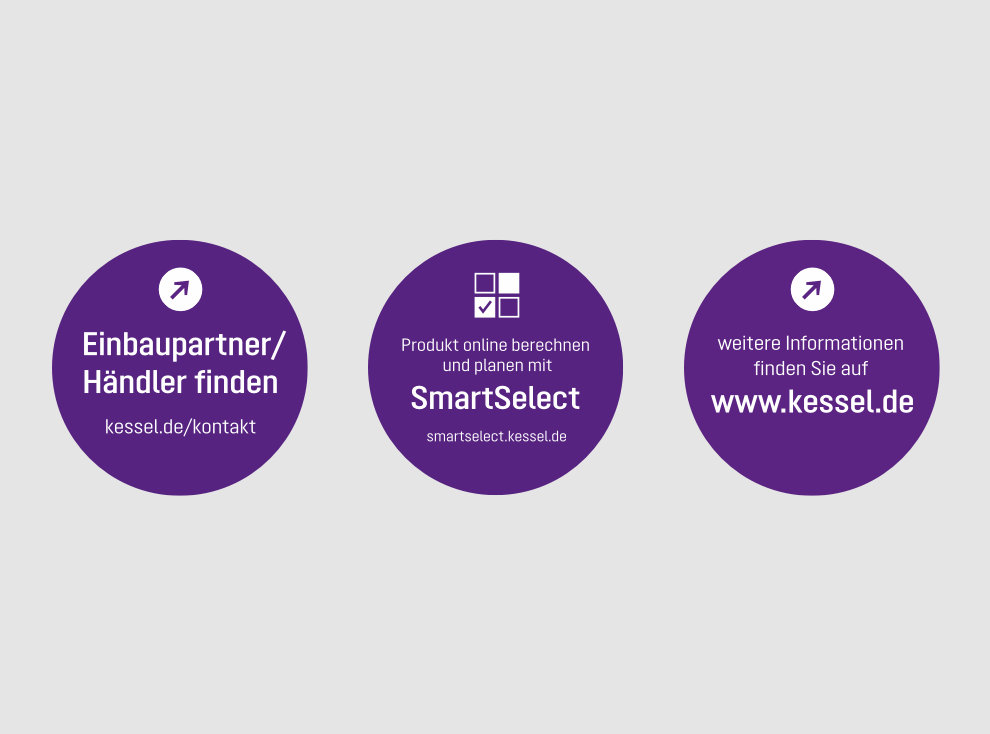
Teaser
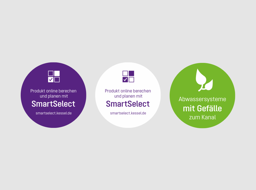
1. Circular shape is preferred – other shapes are possible for thematic references
2. Primary colours are preferred – secondary colour is possible for thematic references
3. Optional combination with icons
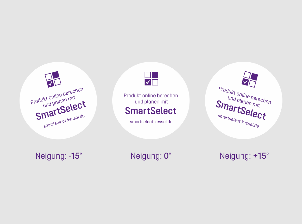
4. Teasers can be rotated +/- 15°
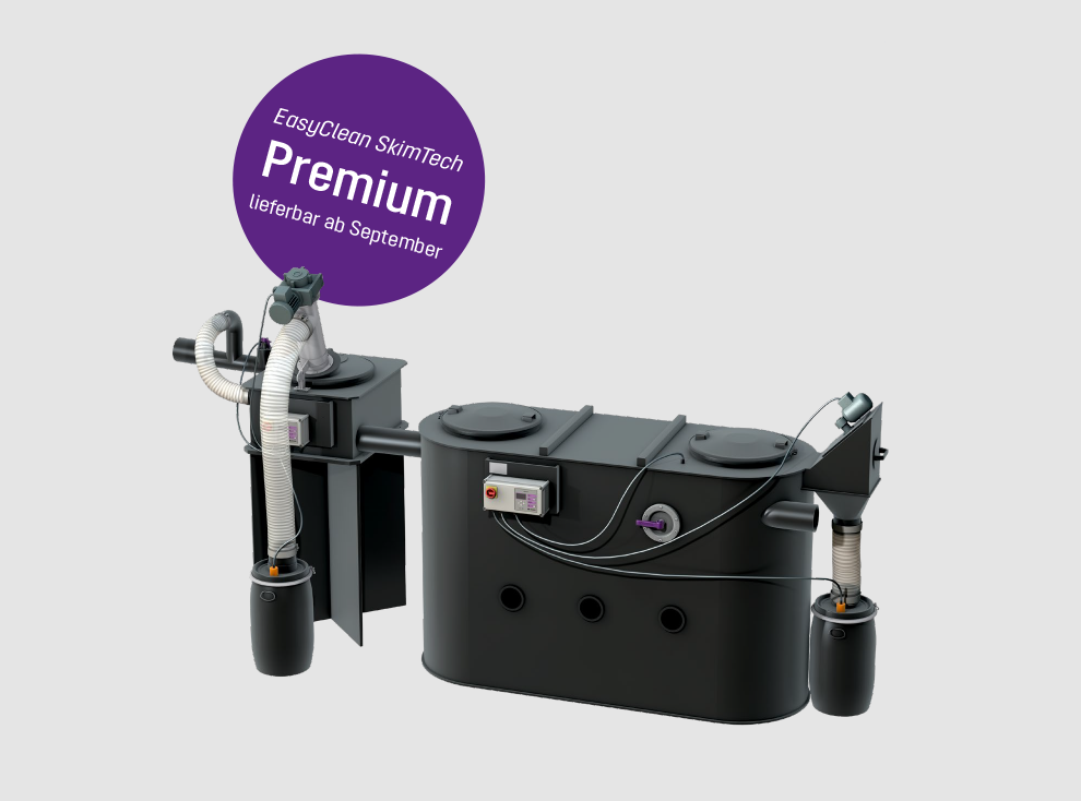
5. Teasers may be positioned behind products.
Please also refer to the guidelines for:
Teaser: Dont’s
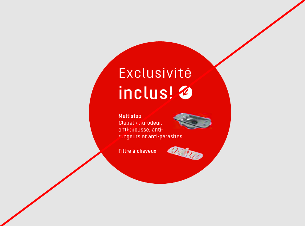
Only use secondary colours with a thematic reference (red is a warning/fault – not a special offer)
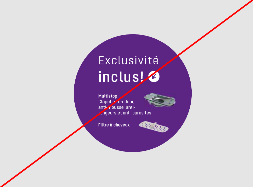
Do not overload teasers. No product images
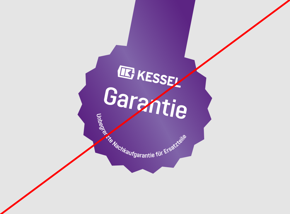
No colour progressions
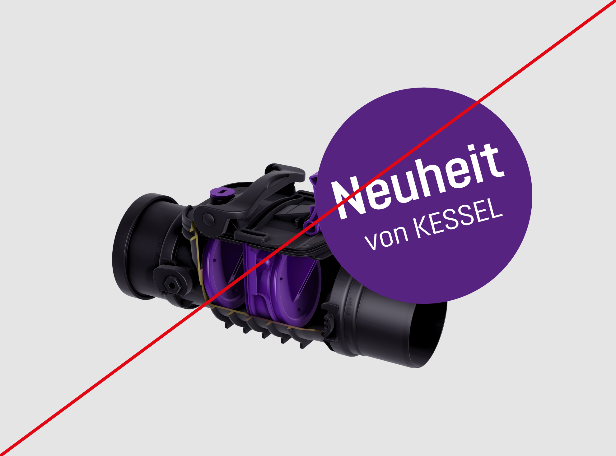
Teaser must not cover product images

Do not overload teasers
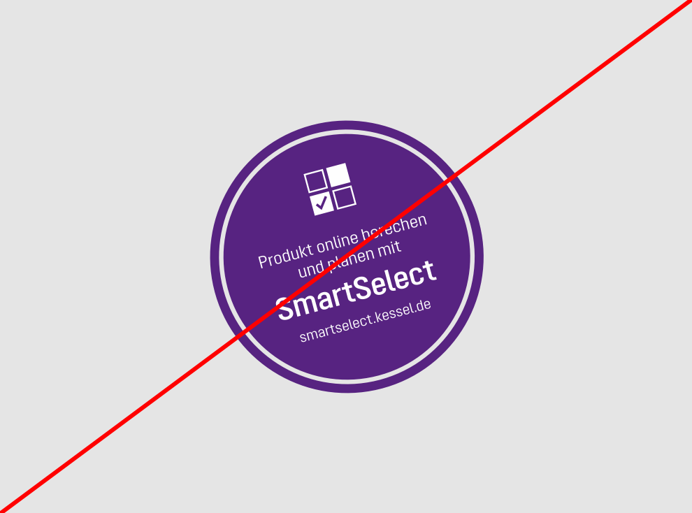
No contours or graphical emphasis
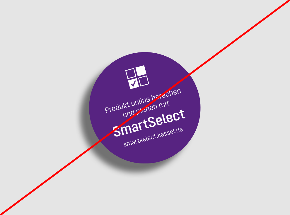
No shadow effects
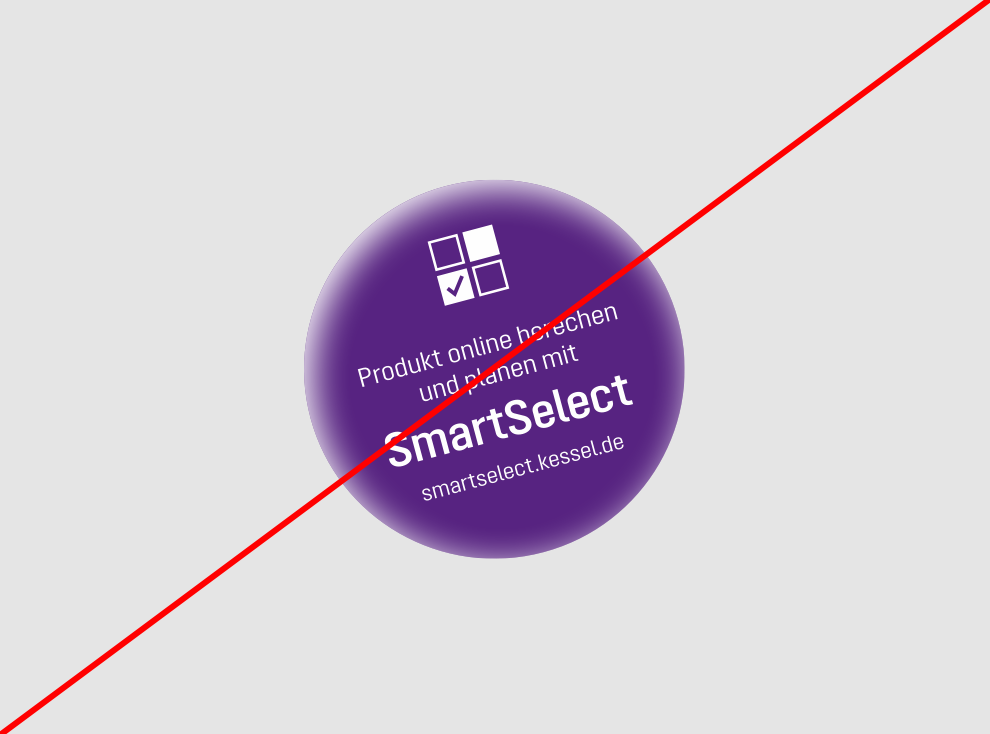
No relief effects
Design element
Cross reference to print online
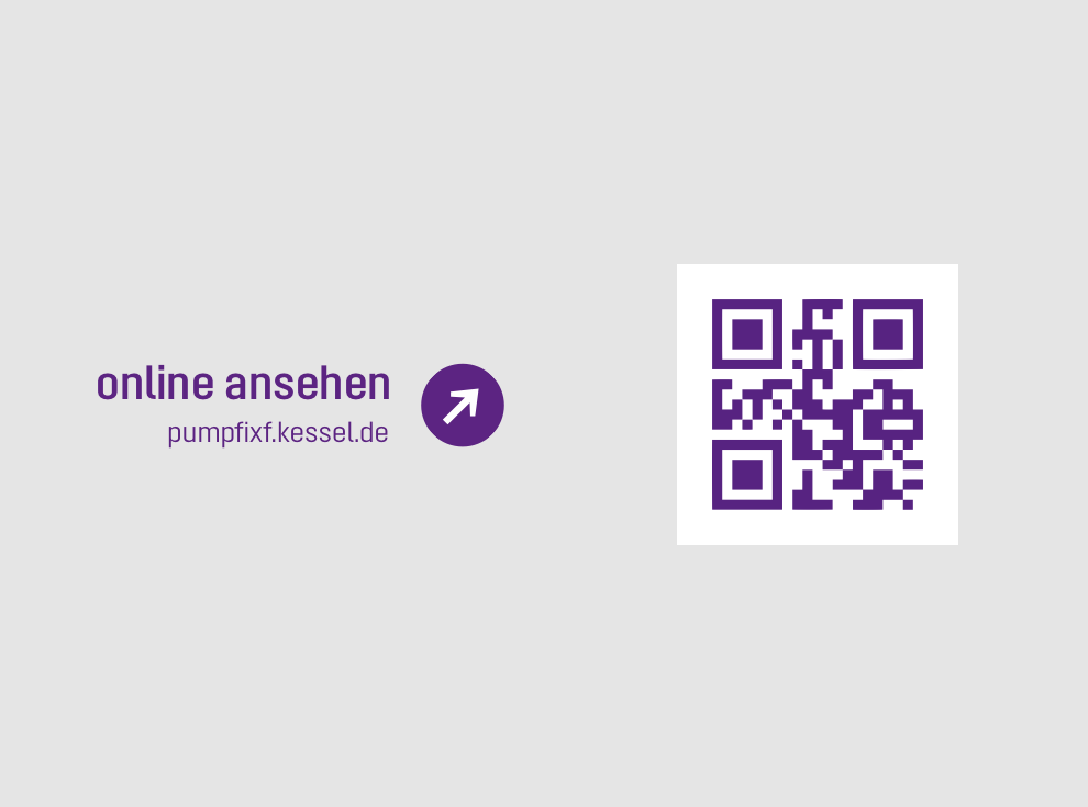
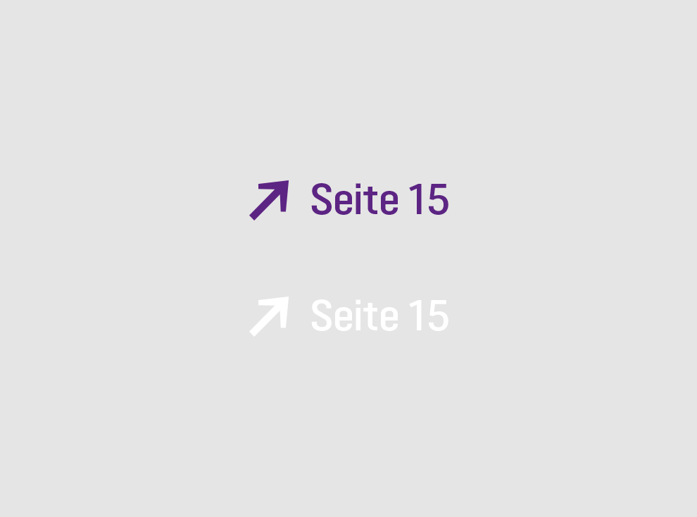
A clear reference is made in print publications to further information or additional services on the Internet. This is achieved with the following, amongst others:
1. Jump marks and QR codes
2. Page reference
3. Teasers with URLs
The preferred arrowhead comes from the glyphs of the Opinion Pro font. It can be selected here using Copy&Paste:
→←↑↓
All existing clickable links are stored in an interactive PDF in print publications.
Design element
Lines
Lines are an important design element for the structuring of content. They are used in two thicknesses at a ratio of 1:4 to each other – 0.25 pt and 1 pt for print. The colour is always violet on white or white on violet.
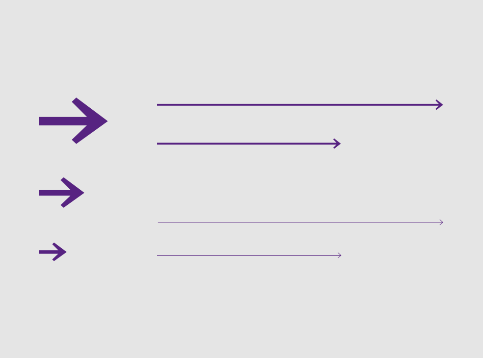
Lines are an important design element for the structuring of content. They are used in two thicknesses at a ratio of 1:4 to each other – 0.25 pt and 1 pt for print. The colour is always violet on white or white on violet.
Design element
Form elements
Form elements to be completed consist of violet lines and boxes in two line thicknesses.
1. Example: text lines
2. Example: check boxes and boxes
3. Example: large boxes
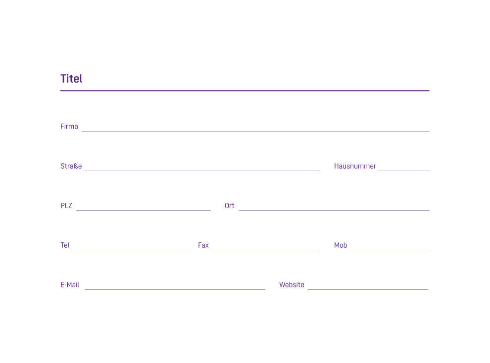
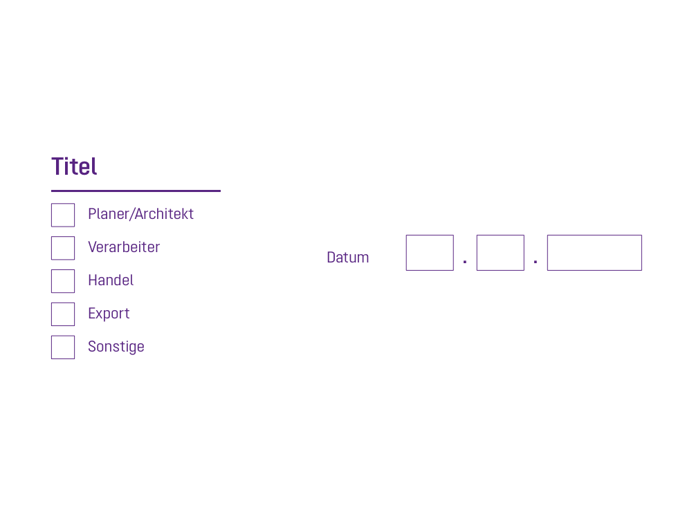
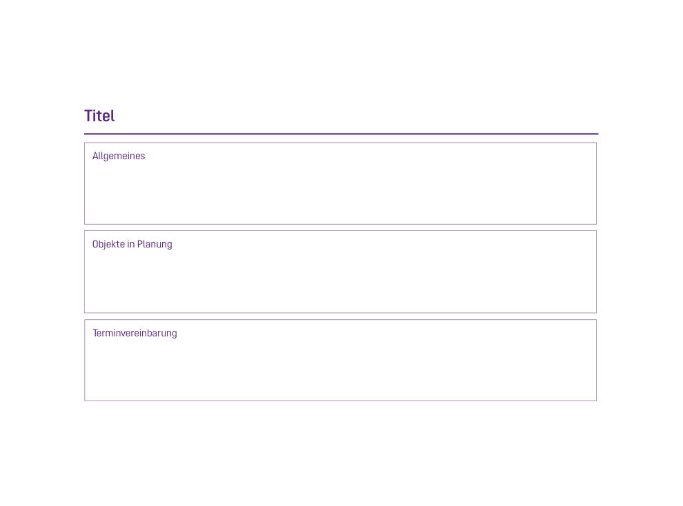
Form elements to be completed consist of violet lines and boxes in two line thicknesses.
1. Example: text lines
2. Example: check boxes and boxes
3. Example: large boxes
Design element
Table of contents
Tables of contents are used and designed depending on the purpose of the publication. Tables of contents are generally based on the tables. Find out more about this in the typography section:
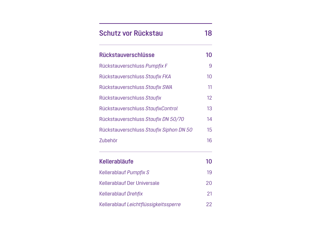
Tables of contents are used and designed depending on the purpose of the publication. Tables of contents are generally based on the tables. Find out more about this in the typography section:

