Flexible & modular
The page layout is based on a modular principle that allows plenty of creative freedom whilst still ensuring that it remains unmistakably KESSEL.
Best Practice
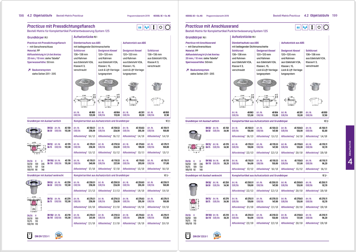
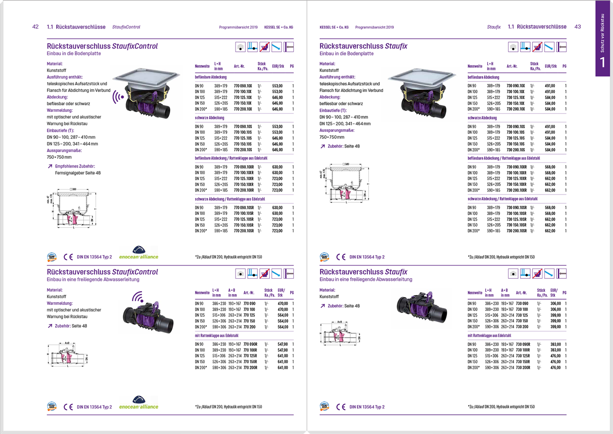
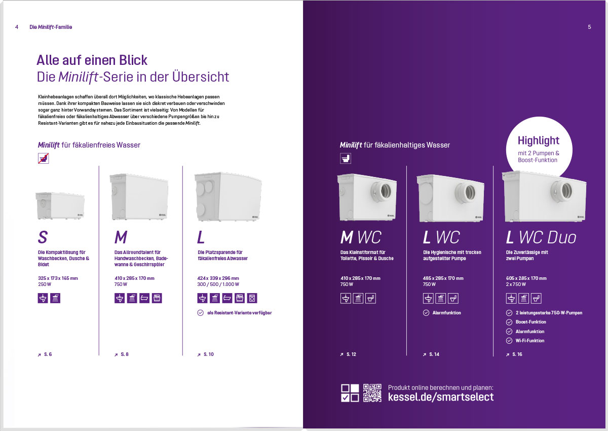
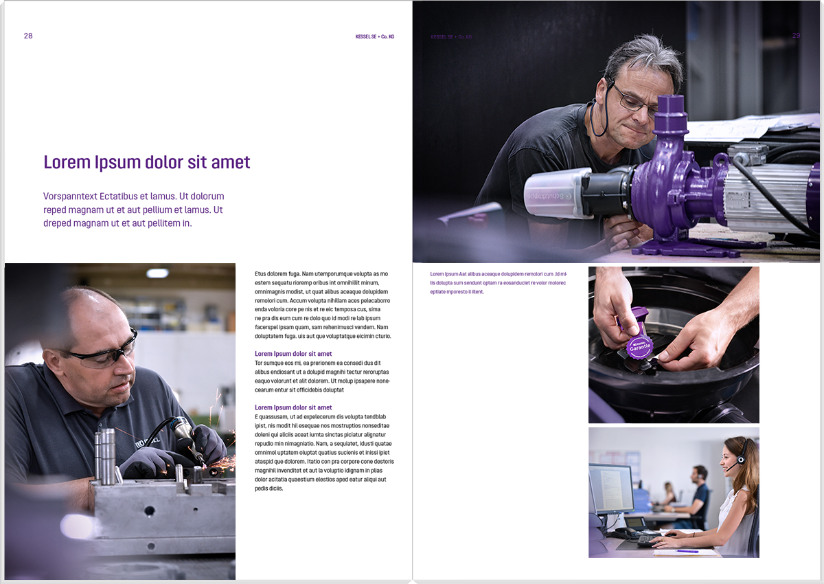
Useful tips


Structure contents
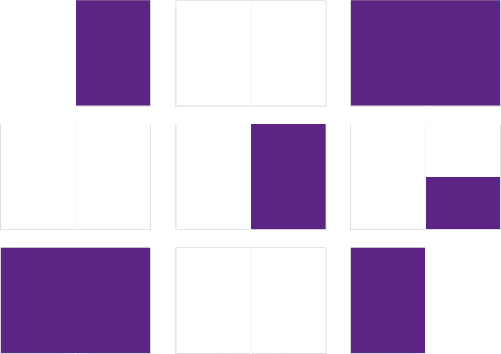
The KESSEL Violet, KESSEL Dark Violet and the colour gradients are used to structure the layout and guide the reader. The Brand Zone is always violet or white, the Product Stage always has a gradient, and dark violet is used for the Highlight Zone. This structure provides clarity and guidance at first glance.



Use of images
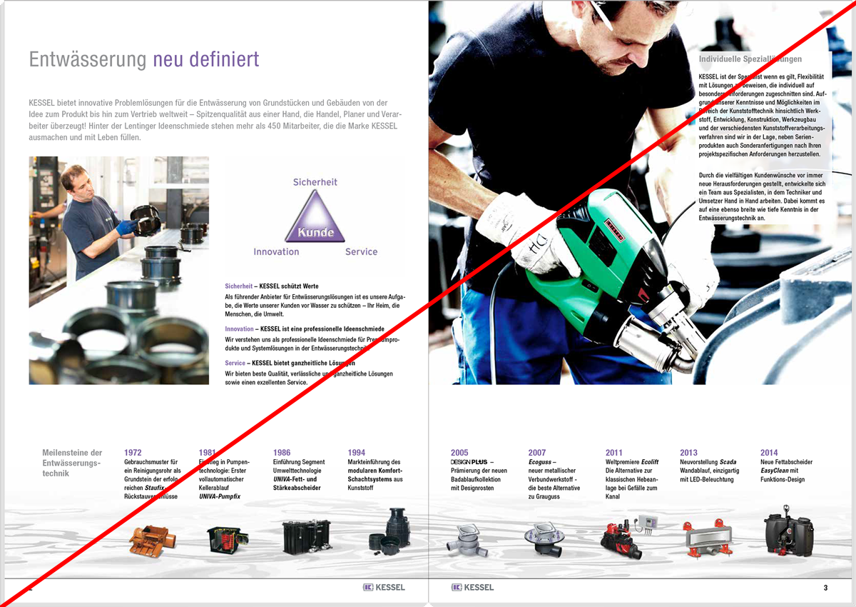
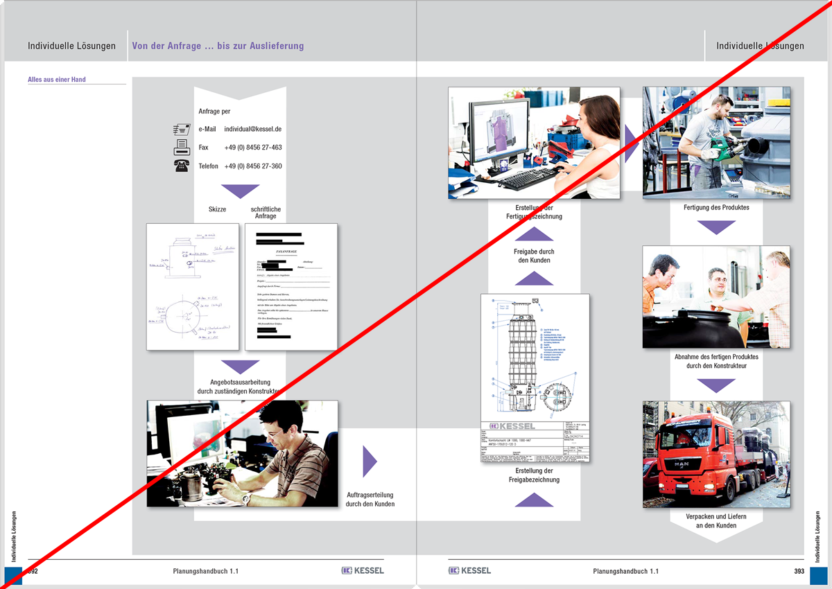
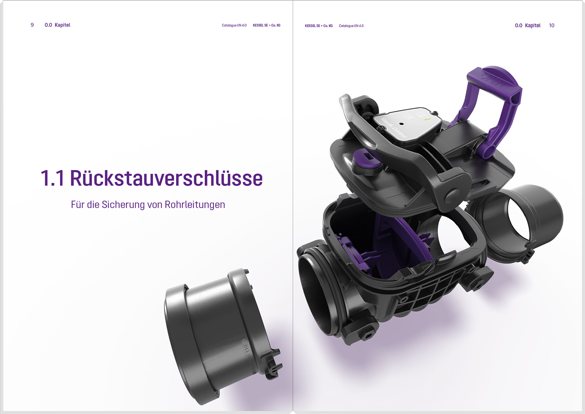
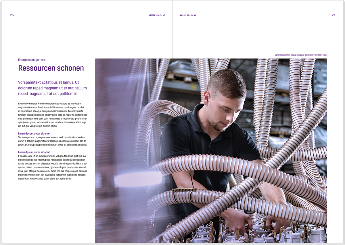
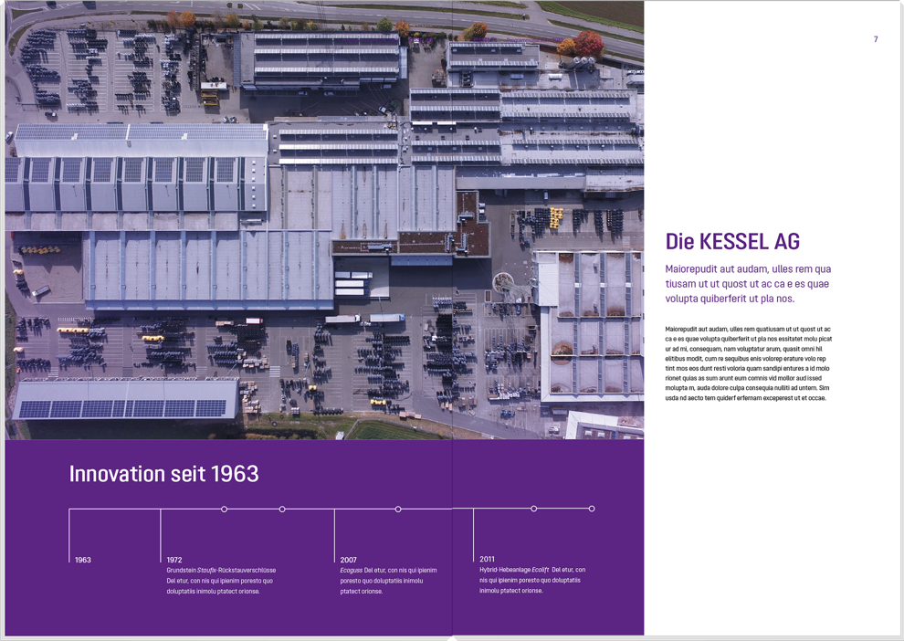
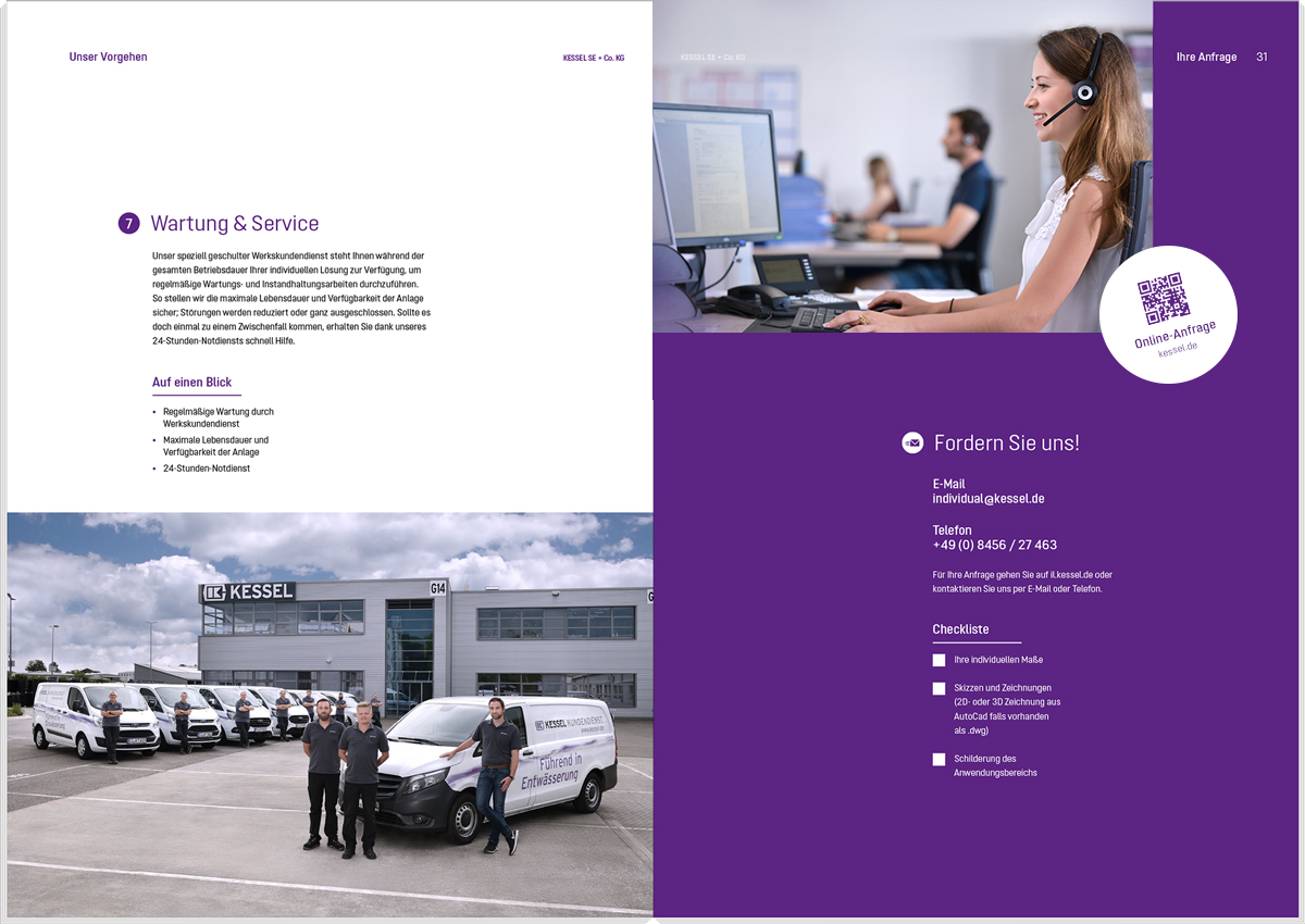
Photos are generally used extensively in the layout to enable the images to have an effect. An exciting page composition is taken into account here, contrasting the different image sizes with each other and also permitting white space. Small images and the accumulation of motifs result in the individual motifs being less significant and are avoided.
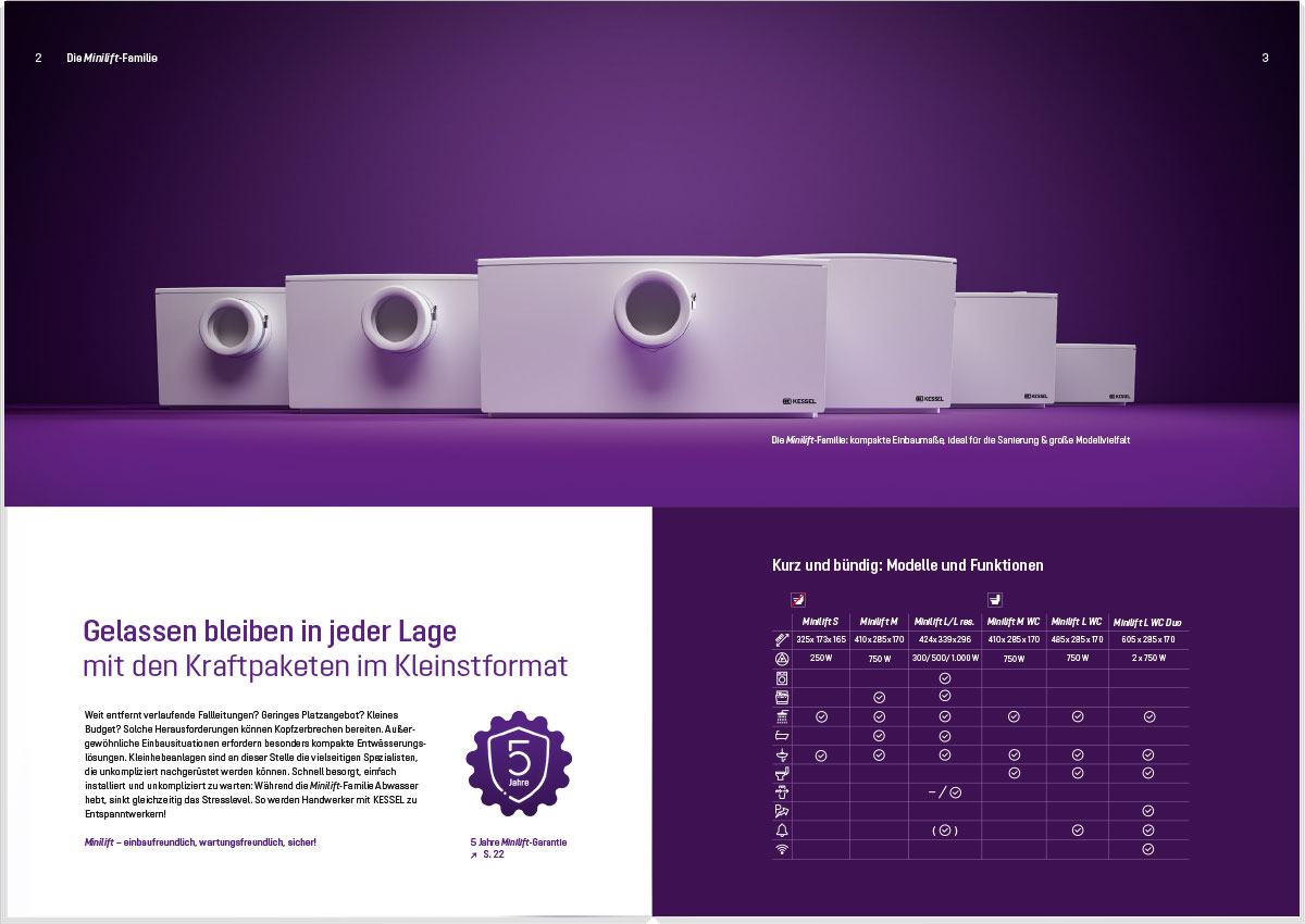
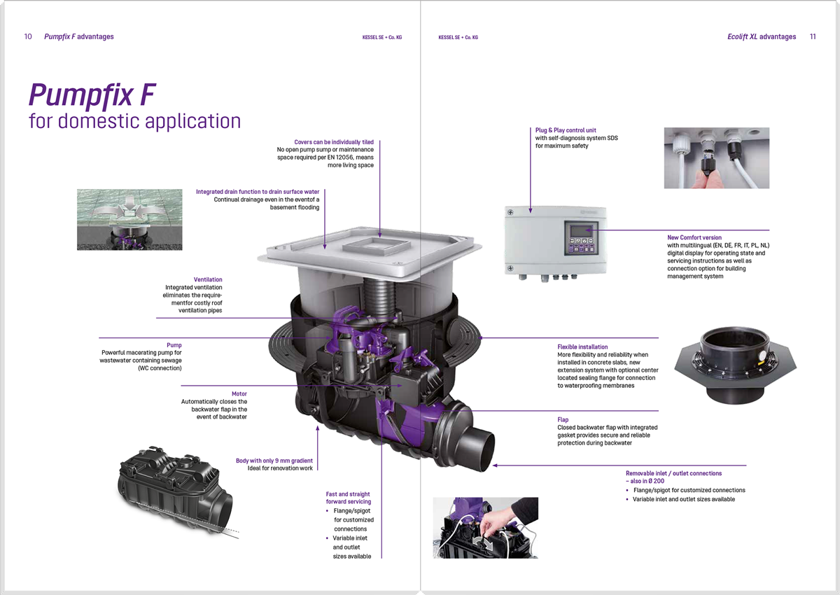
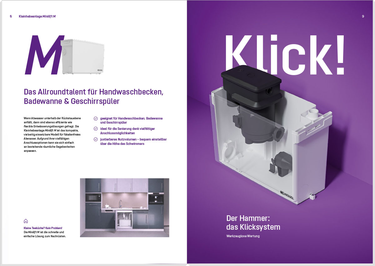
1.-3. Exciting use of images
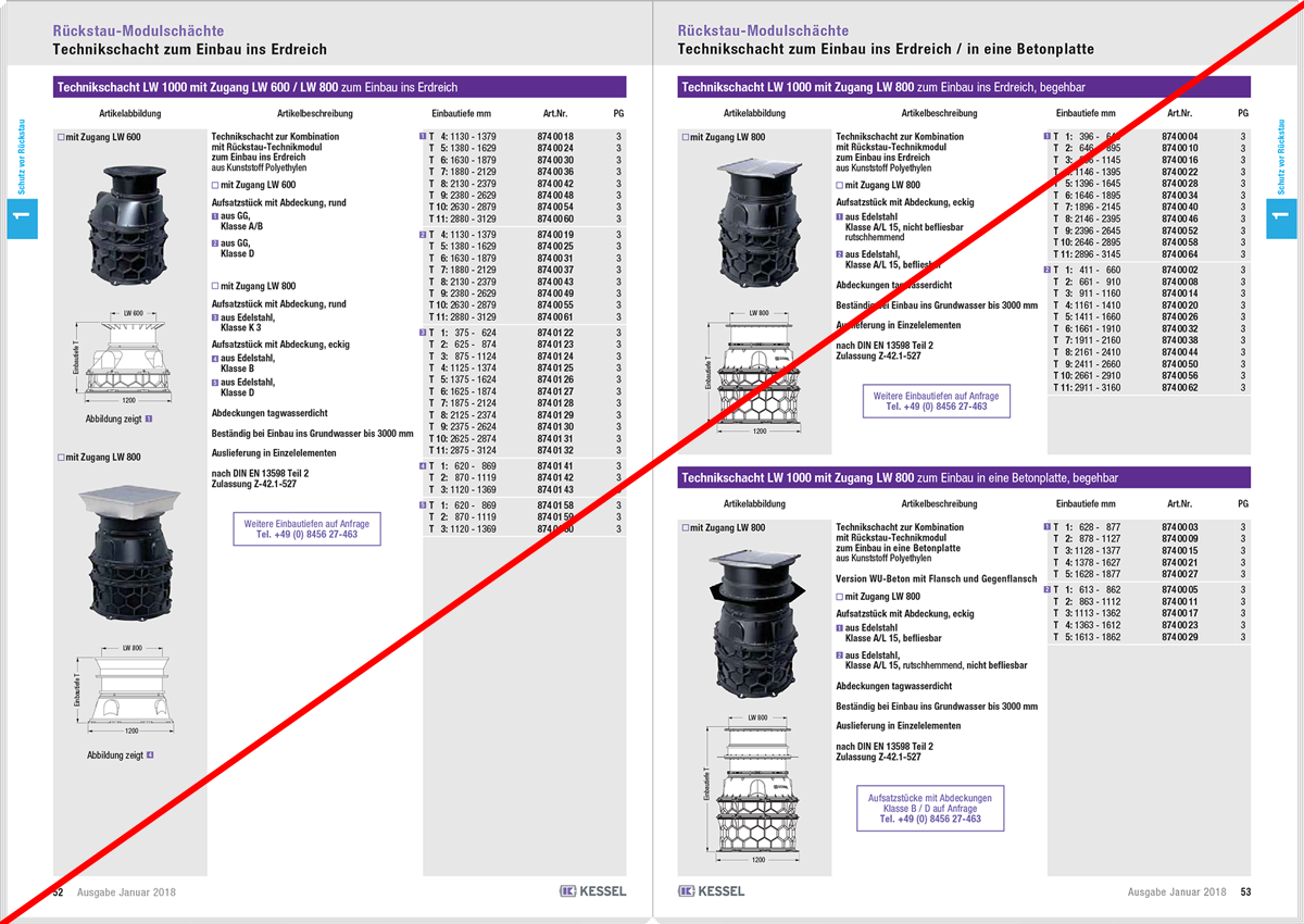
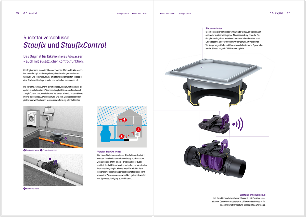
4. Too many and too small images
5. Page too full and not exciting enough
Please also refer to the general information about photography:
Pagination and headings
1. The page number is always placed in the top, outer page margin.
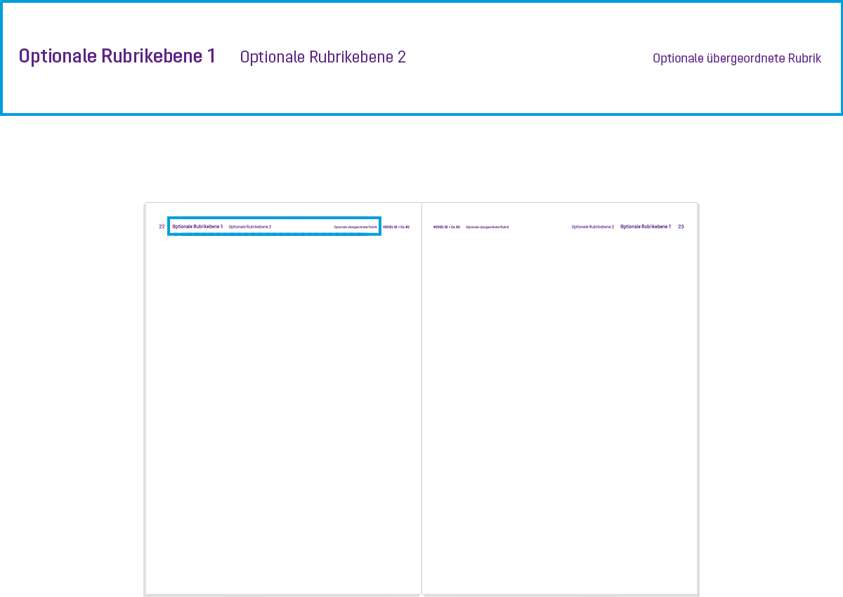
2. The top page margin acts as an optional navigation bar. Information to help the reader find their way is collected here depending on the scope of the publication. This is not required on smaller brochures.
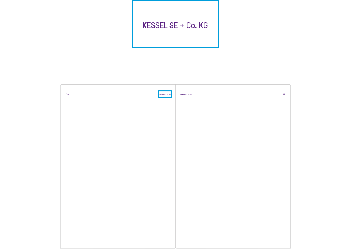
3. When individual pages are often used on their own for a publication (e.g. product overview), the typographical addition of KESSEL is placed in the top inner page margin. The KESSEL logo is not used.
These elements are included as standard in the following template files, but the size and scope can be adapted depending on the purpose of the publication.